
Go City - Itinerary Feature Case Study
We started from one strong belief: that in today's world, new and memorable experiences constitute our true personal luxury. We are convinced that these unique moments are what enrich our lives and leave a lasting impact. So here's to the memories in the making, to those extraordinary experiences that become the stories we cherish and share.
Role
UX Research Concept Validation Research Planning Unmoderated Testing Usability Studies Surveys Journey Mapping Insight Synthesis Actionable Recommendations Behavioral Analysis Feature Optimization
Methods
Unmoderated usability testing Customer surveys Traveller journey mapping
Year
2023
Platforms
Mobile App
The Challenge
Go City’s mobile app helped travellers discover attractions and redeem passes across multiple destinations, but the trip planning experience was fragmented. Users could browse attractions, but had no central place to organise their visit, build daily itineraries, or access saved attractions easily.
Travellers often juggle multiple attractions, varying opening hours, and limited travel time. Without a clear planning tool, pass holders risked missing experiences or feeling overwhelmed.
The product team asked: How might we design an intuitive itinerary feature that supports real-world travel planning while enhancing the value of Go City passes?
My Role
As the sole UX researcher embedded on the product design team, I partnered with designers, PMs, and engineers to:
Identify research opportunities and validate early design concepts
Plan and conduct unmoderated usability studies and surveys
Map traveller journeys and synthesise insights into actionable recommendations
Ensure the feature supported dynamic, real-world trip planning behaviours
I owned research strategy, execution, and insight delivery across the full design lifecycle.
Design Development
The design team explored multiple ways for users to build itineraries by saving attractions and organising them into daily plans. Early wireframes progressed quickly into high-fidelity prototypes, which became the primary artefact for usability evaluation.
See Complete file here
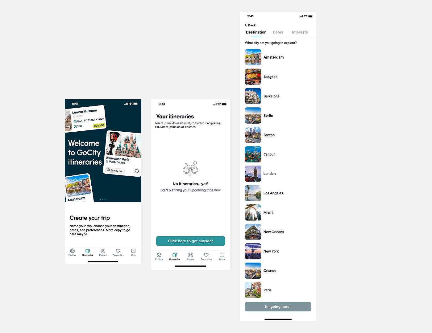
Caption: Early interface designs exploring how travellers could organise attractions within the itinerary feature.
Research Approach
We implemented a mixed-method research plan combining behavioural and attitudinal insights:
Methods used
1. Unmoderated usability testing
Participants: Existing Go City pass holders and new users
Tasks: Create an itinerary, add attractions, review planned activities
Goal: Observe realistic planning behaviour and identify friction
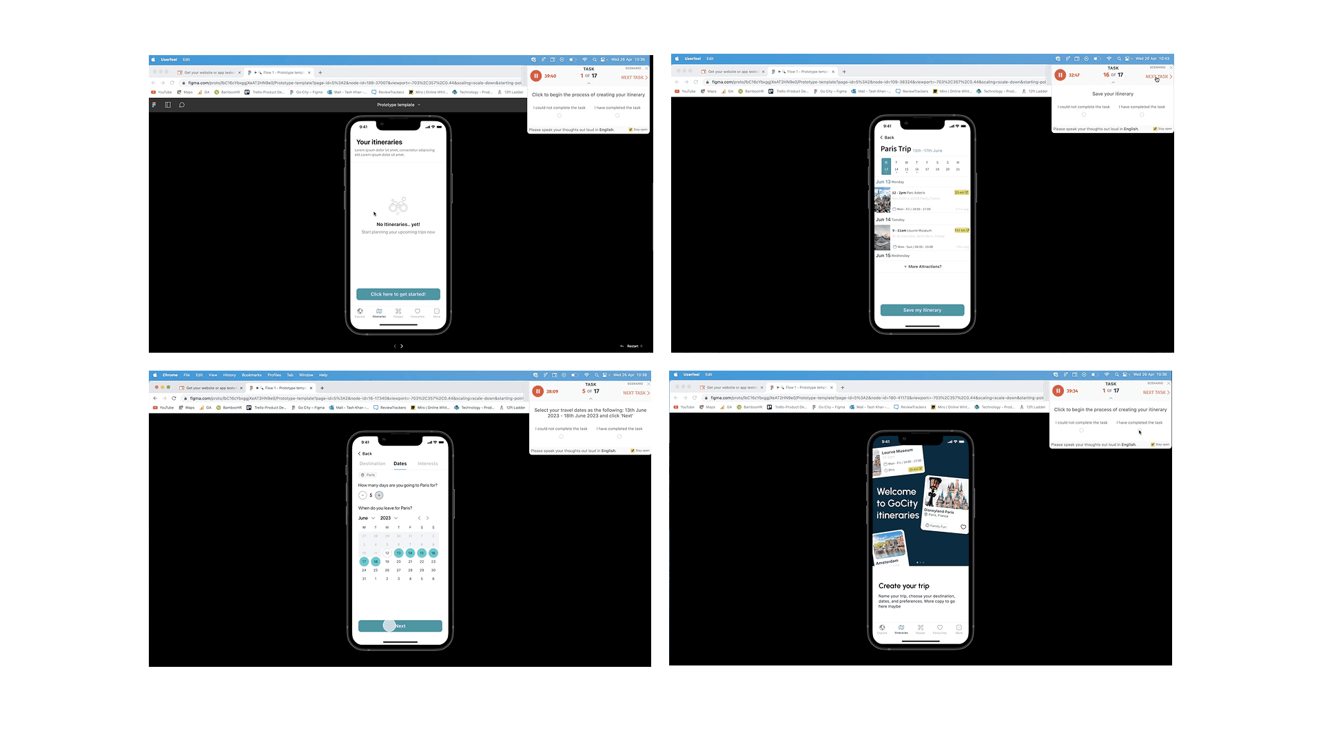
Caption: Unmoderated usability sessions were used to evaluate how easily travellers could create and manage itineraries within the app.
2. Customer surveys
Distributed to current users to gather feedback on travel planning needs and the new itinerary feature
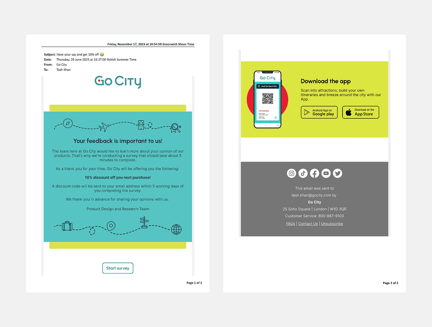
Caption: Email invitation sent to Go City customers to recruit participants for the survey and a snippet from survey results.
3. Traveller journey mapping
Analysed where itinerary planning fit in broader travel behaviours and app usage
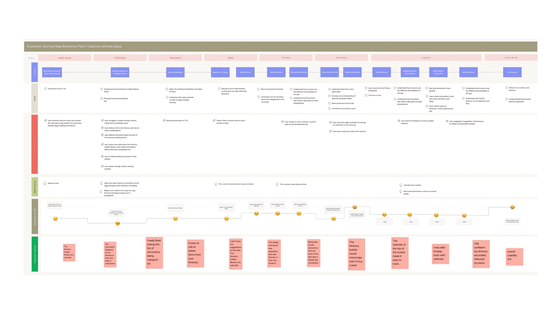
Caption: Customer Journey Maps highlight the users’ journeys for both with and without a pass.
Key Insights
Usability testing confirmed that the core functionality was intuitive and highly valued, but several areas required clearer guidance:
Starting the itinerary was unclear — users didn’t know the flow had begun.
Onboarding interactions lacked visual cues — swipe gestures and progress markers were often missed.
Key planning inputs were hidden — trip duration and time selection were not immediately visible.
Edit/delete controls lacked visibility — users struggled to manage their plan.
UI elements were misinterpreted — some participants confused components with the itinerary builder itself.
Positive feedback: Participants found adding/removing attractions simple and the itinerary overview helpful for planning.
Design Actions
Based on research insights, we implemented improvements:
Added step-by-step onboarding and visual progress indicators
Increased visibility of trip duration and time selection fields
Clarified interaction feedback for saving attractions
Made edit/delete controls prominent
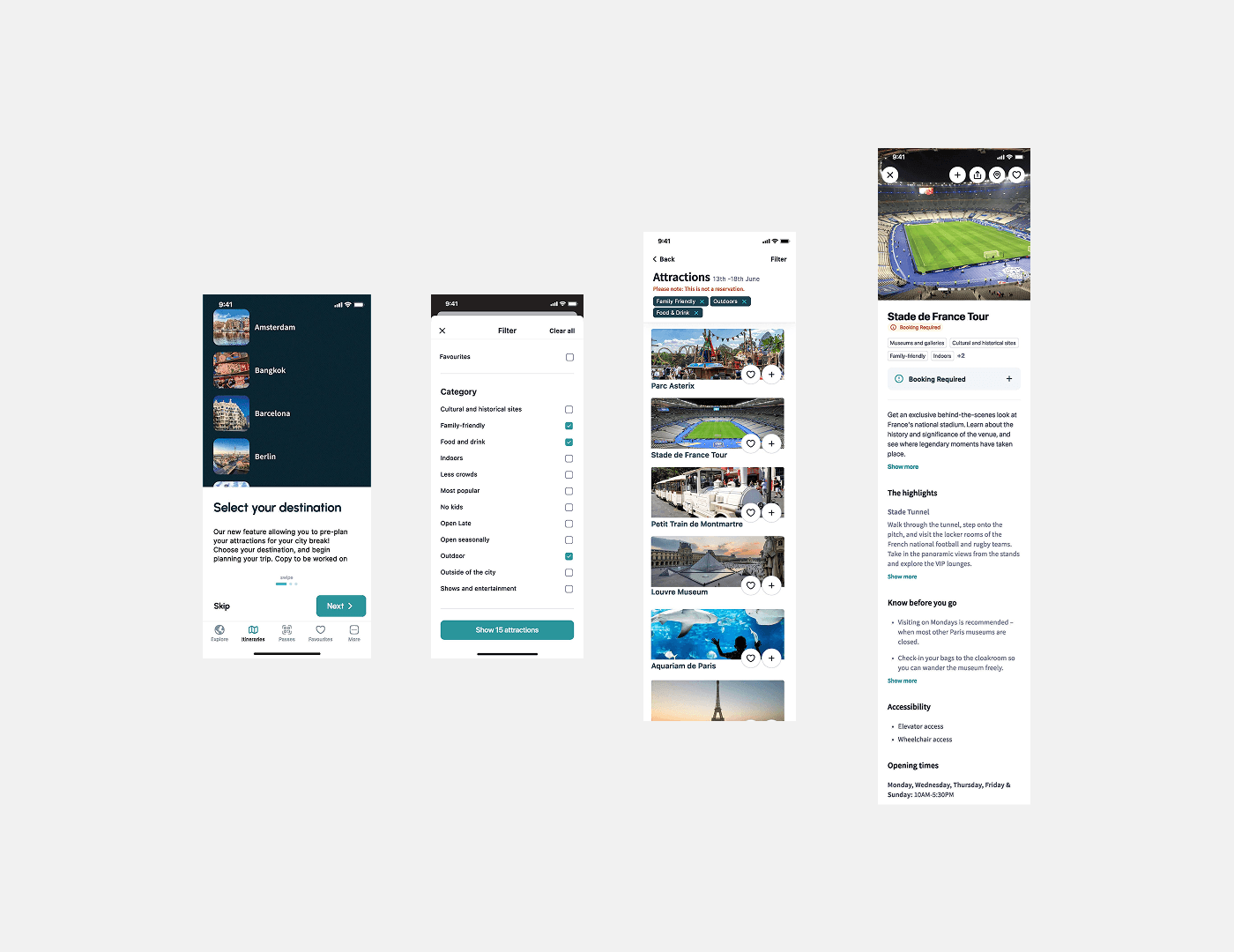
Caption: Final interface allowing users to create and manage itineraries directly within the Go City app.
Outcome & Impact
The itinerary feature delivered a centralised planning hub in the app. Key outcomes:
Users could easily create and manage daily itineraries
Positive feedback confirmed the feature added real value to Go City passes
Usability ratings were consistently high across new and existing users
The feature helped travellers navigate busy travel schedules and make better use of their passes.
Reflection
This project reinforced the importance of validating features in real-world contexts.
Travellers plan dynamically, balancing multiple attractions, timing, and locations. Designing a flexible, intuitive itinerary tool required observing real behaviour, iterating fast, and integrating research throughout the design cycle.
As the sole UX researcher, I saw firsthand how embedding research from concept to launch drives measurable impact on both user experience and business outcomes.